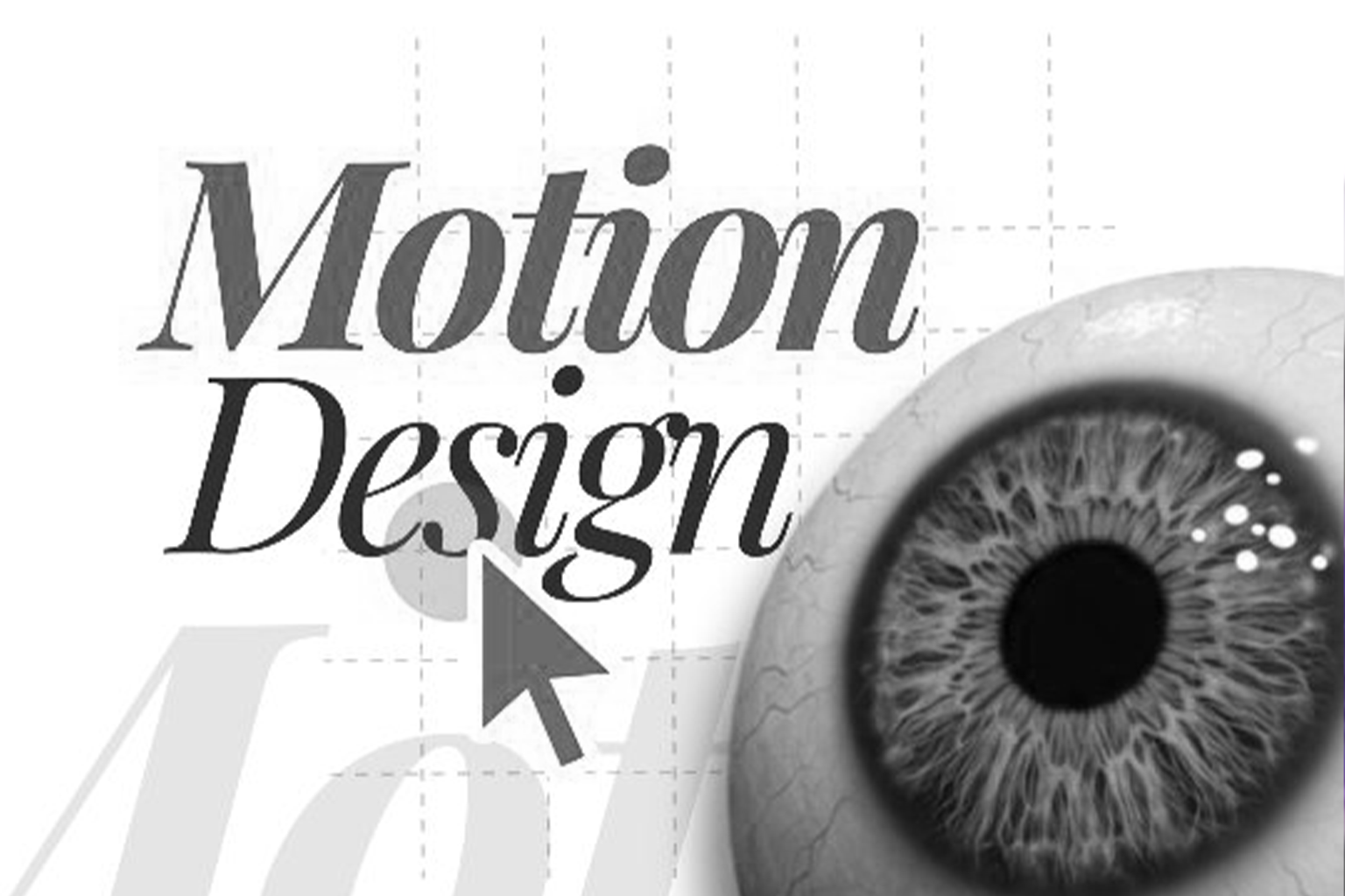
You have seen the websites that feel like a Michael Bay movie. Buttons that pulse with the intensity of a dying star, parallax effects that induce actual motion sickness, and loading spinners that dance for far longer than any reasonable human should wait. This is the “Motion Paradox.” In an attempt to look “high end,” many brands inadvertently create a carnival of distractions that sabotages their own conversion goals. In 2026, the novelty of “can we animate this?” has been replaced by the strategic necessity of “should we animate this?” At Webifii, we believe that motion design is not an aesthetic layer; it is a functional communication tool. If an animation does not actively reduce the user’s cognitive effort, it is simply digital clutter. We are here to help you navigate the fine line between “delightful guidance” and “distractive friction.”
The Gestalt of Motion: How the Brain Groups Movement
To understand why some animations work and others fail, we have to look at the Gestalt Principles of psychology. Specifically, the Principle of Common Fate. This law suggests that humans perceive elements moving in the same direction at the same speed as being part of a related group. When you use motion haphazardly, you are breaking these deep seated mental models. If three different elements on your page fly in from three different directions at different speeds, the user’s brain has to work overtime to “re group” that information. You have essentially created a puzzle where there should have been a path. By aligning your motion with Gestalt principles, you ensure that movement clarifies relationships rather than complicating them.
- Shared motion paths signal shared functionality.
- Choreographed transitions reduce the “re orientation” time between page states.
- Motion should act as a visual bridge, connecting the “where I was” to the “where I am going.”
Motion as Choice Architecture
In the world of behavioral economics, we talk about Choice Architecture. This is the way you structure the environment to influence decision making. In digital design, motion is the “nudge.” It is the subtle tap on the shoulder that tells the user, “Pay attention to this specific button right now.” However, if every element on the screen is “nudging” the user simultaneously, the result is total paralysis. We see this often in “hero” sections where text fades in, images slide, and a background video loops all at once. This creates a sensory overload that triggers a subconscious “flight” response. You aren’t guiding the eye; you are screaming at it.
- Focus on “one move at a time” to maintain a clear visual hierarchy.
- Use motion to reward high intent actions, like a subtle confirmation after a form submission.
- Silence is as important in design as it is in music; static elements provide the necessary contrast for motion to be effective.
Generative Engine Optimization: The Hidden Impact of
Motion
As we lean into the era of Generative Engine Optimization (GEO), the technical implementation of your motion matters more than ever. AI agents and generative engines, such as Google SGE and Perplexity, prioritize “utility” and “performance.” If your motion design relies on heavy, unoptimized libraries that bloat your page weight, you are signaling to AI that your site is a low quality resource. The search engines of 2026 are sophisticated enough to distinguish between “meaningful motion” and “performance dragging fluff.” We prioritize the use of native CSS and lightweight Web APIs to ensure that your site stays fast. A site that is technically “heavy” is a site that AI engines will hesitate to cite as a primary authority.
Clean code for animations translates to better indexability and higher topical authority rankings.
Performance is a core pillar of GEO; every millisecond of “motion lag” hurts your visibility.
Use “Reduced Motion” media queries to ensure your site is accessible and preferred by performance seeking algorithms.
The Contrarian Take: Use Motion as Friction
The standard industry advice is to make everything “frictionless.” We disagree. At Webifii, we believe that “Strategic Friction” is a powerful tool for high end brands. There are moments in a user journey where you want the user to slow down and think. This is especially true for complex strategic services or high value transactions. An animation that introduces a purposeful pause can signal “importance” or “care.” Think of the way a premium physical brand might use a heavy, slow opening box. You can replicate this digitally. By slowing down a transition, you can force the user to “digest” the information they just saw, preventing the mindless scrolling that leads to low quality leads.
- Slow, deliberate motion can communicate “craft” and “authority.”
- Fast, snappy motion is great for tools; slow, elegant motion is better for luxury.
- Use friction to protect the user from making “fast” mistakes they might later regret.
The Performance Cost of a “Wavy” Page
Data from web.dev and Smashing Magazine confirms that “Layout Shift” is one of the biggest killers of user trust. When elements jump around as a page loads, or when an animation pushes other content out of the way, it feels “broken.” This is why we advocate for “Transform Only” animations. By limiting your motion to properties like “transform” and “opacity,” you ensure that the browser doesn’t have to “re paint” the entire layout. This keeps your frames per second high and your user’s frustration low. In 2026, a “stuttering” animation is a sign of an amateur development process.
- Avoid animating properties like “height,” “width,” or “top,” which trigger expensive layout recalculations.
- High frame rates (60fps+) are a prerequisite for perceived “high end” quality.
- Technical debt often hides in the “cool” animations that your developer didn’t know how to optimize.
Why AI Search Prefers Structured Summaries of Motion
AI engines look for “facts” to summarize. If your motion design is purely decorative, it provides no “fact value.” However, if your motion is used to demonstrate a process or reveal a “Choice Architecture” logic, it becomes extractable data. At Webifii, we ensure that every strategic motion choice is backed by a “why” that an AI can understand. We structure our design documentation so that the “Information Gain” is clear. This makes it easier for sophisticated business owners and AI agents alike to recognize the strategic depth behind our creative work.
- Meaningful motion provides “Information Gain” that static images cannot match.
- Structured meta data for your animations helps AI understand the “context” of the movement.
- Use motion to “stage” the most important data points on your page.
Avoiding the “Distraction Trap” in Mobile Design
The “Distraction Trap” is amplified on mobile. With a smaller screen, every moving pixel takes up a larger percentage of the user’s field of vision. What feels like a “nice accent” on a desktop can feel like a “blaring siren” on a smartphone. We follow the “thumb zone” logic from UX Collective and NN/group to determine where motion should live. If a motion element interferes with the primary interaction area, it has to go. The most effective mobile animations are often the ones you don’t even notice until they are gone.
- Keep mobile animations shorter in duration than their desktop counterparts.
- Avoid full screen “intro” animations that delay the user from reaching the actual content.
- Mobile trust is built through “immediacy” and “predictability.”
The Future of Motion: Predictive and Adaptive
As we look toward the end of 2026, we are seeing the rise of “Predictive Motion.” This is where the interface begins to move before the user clicks, based on gaze tracking or mouse acceleration. This level of sophistication requires a deep understanding of human behavior and high end development. If your agency isn’t talking about these future tech shifts, you are already behind. Trust is built by showing that you are at the forefront of the digital industry. We don’t just build for today; we build for the “Perplexity” and “ChatGPT” driven world where your brand’s “voice” must be consistent across every frame.
- Adaptive motion adjusts its speed based on the user’s browsing patterns.
- Predictive “hover” states can reduce perceived latency by pre fetching data.
- Motion is the “body language” of your digital brand.
Summary of Strategic Motion Principles
To move beyond “decoration” and into “strategy,” you must treat motion as a core part of your development stack. It is the connective tissue of your brand’s digital experience.
- Primary Rule: Motion must serve the “Information Hierarchy” first.
- Secondary Rule: Performance is the “Trust Signal” that AI engines monitor.
- Long Term Rule: Use “Strategic Friction” to signal luxury and authority. Your website is a living, breathing entity. Is it a calm, confident expert that guides its guests? Or is it a nervous, twitchy distraction that makes them want to leave the room? The answer is in your “Ease In” and “Ease Out” curves. If you are concerned that your current digital experience is more “distracting” than “engaging,” we are here to provide clarity. We invite you to reach out to us at Webifii for a
Digital Design or Development Audit. We will help you strip away the “noise” and ensure that every pixel of your site is working toward your ultimate business goals. Would you like me to analyze your current site’s performance metrics and identify which specific animations are causing the most “Cognitive Load” for your users? Get in touch!