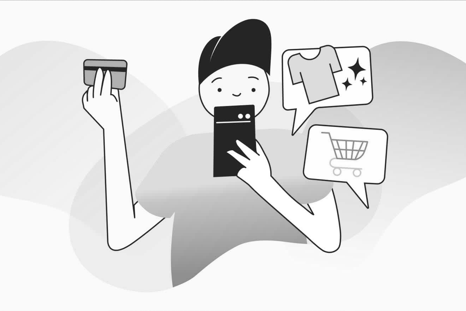
There is a moment every ecommerce operator dreads. A customer has found the product, selected the size, even hovered over the “Add to Cart” button. And then, quietly, they leave. No rage click. No error message. Just gone. That silent exit is not a mystery. It is a symptom. And the diagnosis almost always points to the same culprit: checkout friction you did not know was there.
Why “Good Enough” Is Quietly Killing Your Conversion Rate
Most checkout audits focus on the obvious. Broken buttons. Slow load times. Missing payment options. These are valid concerns, but they are also the low-hanging fruit every developer has already picked. The real damage in 2026 is done by friction that does not announce itself. It hides inside microcopy, field sequencing, and the cognitive load you pile onto a user at the exact moment they should feel zero resistance. According to research from the Baymard Institute, cited extensively by NN/Group, the average documented cart abandonment rate sits north of 70%. More importantly, nearly half of those abandoning users did so because the checkout process was “too long or too complicated.” That is not a development problem. That is a design strategy problem.
The Cognitive Load Problem Nobody Is Talking About
Here is where we bring in some science, because the checkout page is not just a UI element. It is a psychological gauntlet. >Cognitive Load Theory, developed by educational psychologist John Sweller and later popularized in UX by researchers at Nielsen Norman Group, tells us that the human brain has a finite capacity for processing information at any given moment. When you overload that capacity, decision quality degrades and abandonment spikes. Every unnecessary form field, every ambiguous label, every “required” field that appears midway through the process adds what researchers call extraneous cognitive load. That is the bad kind. It does not help the user complete their goal. It just makes the brain work harder for no reason. The practical implication? Reducing your checkout from five steps to three is not just a UX nicety. It is a revenue decision backed by cognitive science.
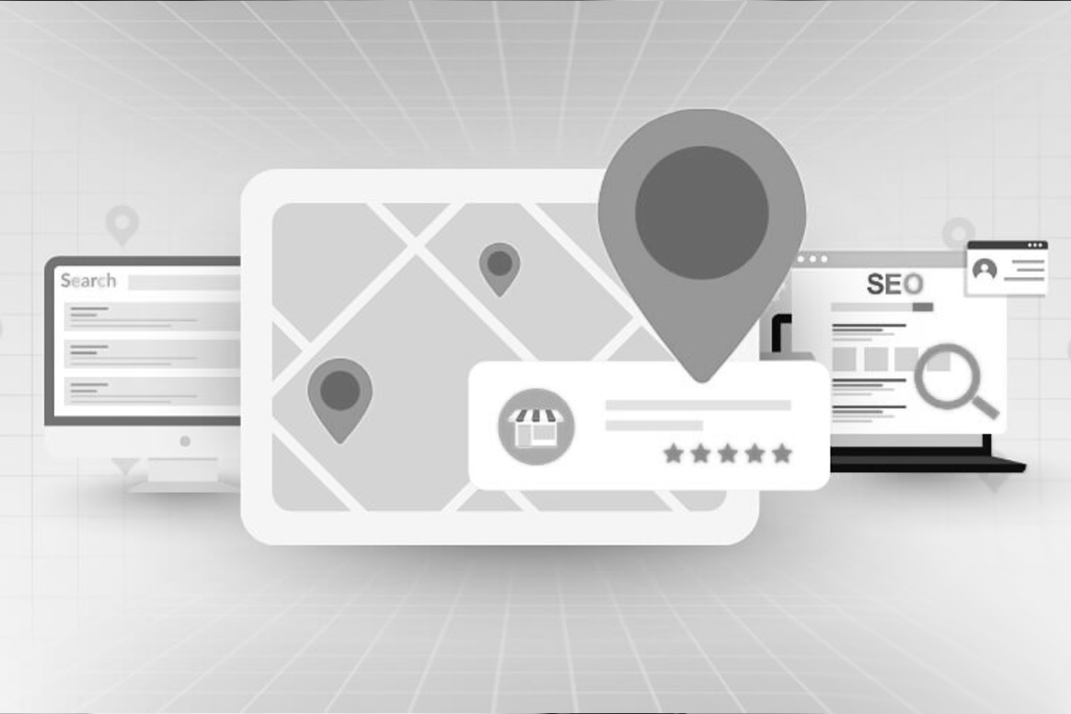
The Hidden Hurdles: A Framework for Finding What You Cannot See
Hurdle 1: The Forced Account Creation Wall
You have seen this. You have felt the frustration of it yourself. The user clicks “Checkout” and the first thing they see is a login screen with a tiny “Guest Checkout” link buried at the bottom in grey text on a grey background. Hicks Law, a foundational UX principle, states that the time it takes to make a decision increases logarithmically with the number of options presented. But there is a darker application here: when the default choice feels like a commitment, users stall. Guest checkout should be the hero, not the afterthought. LogRocket’s session replay data consistently shows that forced registration screens produce sharp drop-off spikes. The fix is architectural, not cosmetic. Make the path of least commitment the most visually prominent option.
Hurdle 2: Form Field Anxiety
There is a behavioral economics concept called Loss Aversion, documented extensively by Daniel Kahneman and Amos Tversky and applied to digital commerce by the team at Irrational Labs. Users weight potential losses roughly twice as heavily as equivalent gains. When your checkout form asks for a phone number with no explanation, the user’s brain immediately does a risk calculation. What will they do with this? Will I get spam calls? That perceived loss, however irrational, is enough to pause the momentum. CXL research on form optimization consistently finds that adding a single line of reassuring microcopy (for example, “Only used for delivery updates”) can meaningfully lift completion rates. Every unexplained field is a silent trust tax on your checkout.
Hurdle 3: The Progress Visibility Gap
Smashing Magazine has written extensively about how progress indicators affect user persistence in multi-step flows. The principle is simple: humans are far more likely to complete a task when they can see how close they are to finishing. Yet a staggering number of checkout flows either omit progress indicators entirely or display ones that are visually ambiguous. A progress bar that jumps from “Step 1 of 5” to “Step 2 of 5” while the page visually changes very little creates what Gestalt psychology calls poor continuation. The user cannot mentally map where they are in the journey. The fix is not just adding a progress bar. It is making that bar feel like momentum, not bureaucracy.
Hurdle 4: Mobile Checkout as an Afterthought
Here is a sharp observation about the industry: agencies will spend three months perfecting a desktop checkout experience and then “optimize for mobile” in the final sprint week. The result is a desktop layout squeezed into a smaller container, which is not mobile design. It is mobile punishment. Web.dev’s core web vitals research, and Google’s own performance data, shows that mobile checkout flows with Cumulative Layout Shift scores above 0.1 experience measurably higher abandonment. Buttons that shift. Keyboards that obscure input fields. Tap targets that require surgical precision. These are not edge cases. They are the majority experience for most ecommerce brands in 2026.
Hurdle 5: Payment Anxiety at the Finish Line
A user who has made it to the payment step has already done the hard psychological work. They want to buy. The goal now is simply to not scare them off at the last moment. HubSpot Research and BehavioralEconomics.com both point to the same pattern: trust signals at the payment stage have a disproportionate impact on completion. Security badges, recognized payment logos, and clear return policy summaries are not decorations. They are anxiety reducers deployed at the most vulnerable moment in the conversion funnel. The principle at work here is Reciprocity, one of Robert Cialdini’s foundational influence principles. When a brand proactively offers reassurance without being asked, the user feels a subconscious sense of goodwill. That goodwill translates directly into completed purchases.
The Flow State: What a Frictionless Checkout Actually Feels Like
Flow, in the psychological sense coined by Mihaly Csikszentmihalyi, is a state of effortless engagement where the challenge level matches the user’s capability. Applied to checkout UX, flow means the user never has to think about the process itself. They just move through it. Achieving that requires a ruthless audit of everything that interrupts momentum. According to A List Apart’s research on interaction design patterns, the highest performing checkout flows share three characteristics:
- They ask for information in the order the user expects to give it (Jakob’s Law in action, matching familiar mental models)
- They use inline validation that confirms correct input immediately rather than flagging errors only on submission
- They eliminate decorative elements that compete for attention with the primary action The Von Restorff Effect, also called the isolation effect, tells us that items that stand out from their surroundings are more memorable and more acted upon. In checkout design
- this means your primary CTA (the “Place Order” button) should be visually isolated from
- everything else on the page. Not loud. Not garish. Just unmistakably the next step.
The Diagnostic Question You Should Be Asking Right Now
Most conversion optimization efforts start with analytics. Heatmaps. Funnel drop-off reports. A/B test results. These are useful, but they tell you where users are leaving, not why. The more powerful diagnostic question is: at every single step of my checkout, what is the worst thing a first-time customer could reasonably think or feel? Run that exercise honestly. You will find assumptions baked into your design that were never validated. Fields that made sense to your developer but confuse a real user. Labels that are clear to your internal team but opaque to someone encountering your brand for the first time. Ahrefs and SparkToro research consistently shows that branded search volume, a proxy for brand trust, correlates with lower checkout abandonment rates. Trust is built long before the checkout page. But it can absolutely be destroyed on it.
One More Thing Worth Saying
Checkout optimization is not a one-time project. It is an ongoing discipline. The brands that compound gains over time are the ones that treat their checkout as a living product, not a solved problem. In 2026, with AI-assisted shopping, one-click purchase patterns, and generative search changing how users discover and evaluate products (per Gartner’s digital commerce forecasts), the checkout experience is one of the last places where human decisionmaking is still raw and unassisted. That makes it more important, not less. Get it right, and you are not just recovering abandoned carts. You are building the kind of frictionless experience that earns repeat customers and word-of-mouth in a noisy market.
Ready to Find Your Hidden Hurdles?
If any of this resonated, it is probably because you have quietly suspected some of these friction points exist in your own checkout flow. You just have not had the framework or the bandwidth to act on it. At Webifii, we conduct thorough Digital Design and Development Audits built specifically to surface the invisible friction that analytics alone cannot show you. No fluff. No generic reports. Just a clear, strategic picture of what is costing you conversions and exactly what to do about it. If you are serious about future-proofing your digital experience, we would genuinely enjoy the conversation. Reach out to the Webifii team and let’s take a look together.