By Webifii | Digital Design & Development Intelligence
You spent weeks on that homepage. The copy is tight. The visuals are stunning. The developer pushed the final commit at 2 AM on a Thursday. And your visitors? They read the headline, skimmed the first line of your subheading, and bounced before they ever saw your differentiator. Welcome to the brutal reality of web attention economics. And no, the answer is not “make it prettier.”
What Eye Tracking Data Actually Tells Us (And What Most Agencies Ignore)
The F-Pattern is not a theory cooked up in a design school. It is an empirical finding from Nielsen Norman Group’s landmark eye tracking studies, which tracked the reading behavior of thousands of users across hundreds of websites. The pattern is remarkably consistent. Users read in a horizontal movement across the top of the content area. Then they move down the page slightly and read a second horizontal sweep, shorter this time. Finally, they scan the left side in a vertical movement. The result is a shape that looks like the letter F. Here is the uncomfortable implication most agencies will not tell you: the bottom right quadrant of your webpage is a graveyard. Your call to action buried there? Your testimonial carousel in that corner? Statistical dead zones.
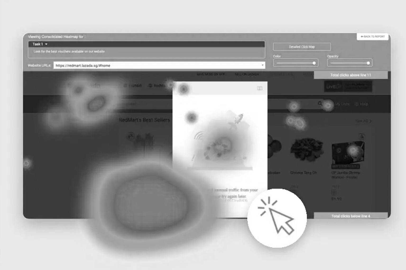
The Heatmap Is Not a Victory Lap. It Is a Diagnosis.
Most businesses see a heatmap and look for the red and orange zones, the “hot” areas, and feel validated. That is entirely the wrong read. The more strategic question is: why is a certain zone cold? Is it because users never scrolled there? Is it because the visual hierarchy funneled attention away prematurely? Or, more damningly, is it because your layout is working against human cognition? Tools like Hotjar, Microsoft Clarity, and FullStory generate scroll maps, click maps, and attention maps. According to research cited by CXL, the average user spends 57% of their page viewing time above the fold. By the time they reach the bottom third of a page, engagement has dropped by more than 74%. That is not a scroll problem. That is an architecture problem.
Cognitive Load Theory: The Silent Killer of Conversions
Here is where behavioral science enters the picture, and it changes everything about how you should interpret your heatmap data. Cognitive Load Theory, originally developed by educational psychologist John Sweller and later applied extensively to UX by researchers at NN/g and the UX Collective, states that the human brain has a finite capacity for processing information at any given moment. When a page overloads this capacity, users do not try harder. They disengage. Think about what this means for your layout. Every competing call to action, every dense paragraph of body copy, every auto-playing video is adding to the user’s cognitive load. The heatmap is not showing you where people are interested. It is showing you where people gave up being overwhelmed. This is why a visually “rich” page often performs worse than a sparse one. It is not an aesthetic preference. It is neuroscience.
F-Pattern vs. Layer Cake Pattern: Knowing Which One You’re Dealing With
The F-Pattern is not universal. This is a nuance that even senior UX practitioners sometimes gloss over. Nielsen Norman Group’s updated research identifies at least five distinct reading patterns across different content types:
- The F-Pattern dominates on text-heavy pages with little visual hierarchy, like blog archives or search results.
- The Layer Cake Pattern emerges when users encounter clear H2 and H3 subheadings, where their eyes jump from heading to heading, skipping body copy entirely.
- The Spotted Pattern appears when users are scanning for a specific piece of information, such as a phone number or a price.
- The Commitment Pattern only occurs when a user has committed to reading, which is rare and earned, not assumed.
- The Bypass Pattern is where users skip the first element entirely, usually because it
looks like a banner ad.
The strategic implication here is significant. If your page is triggering an F-Pattern when you
designed it for a Commitment Pattern, your content strategy and your layout are not
speaking the same language.
Where the Real Money Is: The Left Rail and the First Two
Sentences
Given the F-Pattern’s dominance, the left rail of your page is prime cognitive real estate. This is where the eye returns habitually, especially on mobile and desktop reading layouts. Smashing Magazine’s research on typographic hierarchy confirms that users make a judgment about a page’s credibility within 50 milliseconds of landing on it. That judgment is almost entirely visual, based on layout and perceived structure rather than actual content. Furthermore, the first two sentences of any paragraph carry disproportionate weight. According to content behavior studies referenced by Ahrefs in their content strategy research, drop-off within body copy is steepest after the second sentence of any given paragraph. Users front-load their attention. So should your arguments.
The Von Restorff Effect: Your Secret Weapon Against
Pattern Blindness
Here is a contrarian angle most conversion rate optimization advice misses entirely. Once users are locked into the F-Pattern, they are essentially on autopilot. They stop
reading and start scanning. This is where the Von Restorff Effect, also called the Isolation Effect, becomes your most powerful design tool. The Von Restorff Effect states that an item that stands out from its peers is more likely to be remembered and noticed. In layout terms, this means a deliberate break in visual pattern, such as a highlighted callout box, a bold typographic contrast, or a single sentence in a different color, will interrupt the F-Pattern scan and pull the eye. This is not decoration. This is strategic interruption. Used correctly, it is the difference between a user who scans past your key offer and one who actually stops and reads it. CXL’s research on conversion-focused design confirms that isolated elements within otherwise uniform layouts see significantly higher click-through rates, sometimes dramatically so.
The Mobile Heatmap Is a Different Animal Entirely
Everything we just discussed gets more complicated on mobile, and if your team is still designing desktop-first, this matters urgently. On mobile, the F-Pattern compresses into something closer to a single vertical column scan, biased toward the left edge of the screen on right-handed users (the dominant global majority). According to SparkToro’s analysis of mobile browsing behavior, thumb-zone ergonomics mean that the bottom center and bottom left of a mobile screen receive the most natural tap activity. Yet most mobile layouts still bury primary CTAs at the top right, a convention carried over from desktop paradigms, and one that mobile heatmap data consistently shows is underperforming. The implication for your mobile UX audit is clear. Your button placement, your sticky navigation, and your thumb-accessible zones need to be informed by mobile-specific heatmap data, not desktop assumptions ported across breakpoints.
What a Proper Heatmap Audit Actually Looks Like
A heatmap tool is not a strategy. It is a microscope. You still need to know what you are looking for. At Webifii, when we conduct a design and development audit, we are cross-referencing multiple behavioral data layers simultaneously:
- Scroll depth maps to understand where attention terminates
- Click maps to identify rage clicks and dead clicks (both signals of frustrated intent)
- Attention heatmaps, which weight time-on-zone rather than just cursor movement
- Session recordings segmented by traffic source, because a paid social visitor behaves very differently from an organic search visitor The goal is not to find out where people clicked. The goal is to construct a cognitive model of how a user navigates your page, and then redesign the architecture to serve that journey rather than fight it.
The Choice Architecture Problem Nobody Is Talking About
There is a behavioral economics dimension to all of this that goes beyond visual attention, and it connects directly to your conversion rate. Choice Architecture, a concept popularized by Nobel laureate Richard Thaler and Cass Sunstein in their seminal work on behavioral nudges, holds that the way options are presented profoundly influences the choices people make. In web design, this translates directly to layout decisions. If your heatmap shows that users are clicking a secondary CTA more than your primary one, that is not a content problem. It is an architectural one. You have inadvertently designed a layout where the path of least resistance leads to the wrong outcome. The fix is not to rewrite your copy. It is to restructure the visual hierarchy so the intended path feels like the natural one. This is the intersection of behavioral science and UX design that separates genuinely strategic digital work from cosmetic redesigns.
What to Actually Do With This Information
Let us bring this to the practical level.
If you want to align your web design with how human attention actually works, start here:
- Audit your above-the-fold zone ruthlessly. Your primary value proposition and primary CTA must land within the first scroll-stop, because 57% of viewing time lives there.
- Break the F-Pattern deliberately on your highest-value pages using the Von Restorff Effect. Introduce one visually isolated element per key section.
- Stop designing for visual symmetry and start designing for cognitive sequencing. Users do not experience a page spatially. They experience it temporally, one fixation at a time.
- Run separate heatmaps for mobile and desktop. Treat them as distinct UX problems, because they are.
- Review your click map for rage click clusters. These are almost always indicators of a layout that has broken user expectation through poor visual affordance.
The Hard Truth About Beautiful Websites
A visually stunning website that ignores attention economics is not a premium product. It is an expensive liability. The research is clear and the heatmaps are unambiguous. Human attention is patterned, predictable, and finite. The brands winning online in 2026 are the ones treating web design as an applied behavioral science, not a graphic arts exercise. Design that converts is design that understands cognition. Everything else is wallpaper.
Ready to See What Your Heatmap Is Actually Telling You?
If you have been running a website on instinct rather than behavioral data, there is a very good chance your layout is costing you leads you never knew you were losing. Webifii offers a comprehensive Digital Design and Development Audit that goes beyond aesthetics. We map your user attention patterns, identify conversion architecture failures, and deliver a clear, actionable redesign brief grounded in the behavioral science outlined here. Reach out to us if you want a second pair of eyes on your digital presence. No pressure, no jargon, just a clear-eyed look at where your customers are actually going and what to do about it. Webifii is a premium digital agency specializing in high-end design and development for ambitious brands. We build digital experiences that perform as well as they look.