By Webifii | Digital Design & Development
There is a quiet crisis happening inside most digital agencies right now. Clients sign on, projects get delivered, invoices get paid, and then somewhere around month four or five, the relationship quietly dies. Not with drama. Not with a harsh email. Just silence.
The uncomfortable truth? Most agencies mistake project delivery for client retention. They are not the same thing. Not even close.
Why Your Clients Are Quietly Leaving (And What It Has to Do With Data)
Retention is not a sales problem. It is a perception problem.
According to HubSpot Research, clients who feel consistently informed about their account performance are significantly more likely to renew and expand. The keyword there is feel. Not just be informed. The perception of transparency is what creates loyalty.
Custom dashboards are not reporting tools. They are retention architecture. When built correctly, they make a client feel like they are holding the steering wheel, even when your team is doing all the driving.
The Cognitive Load Problem Nobody Talks About
Here is where most agencies get it catastrophically wrong.
They build dashboards stuffed with every metric imaginable. Bounce rate, sessions, CTR, ROAS, domain authority, conversion rate, heatmap overlays, all piled into one screen like a digital junk drawer. They think more data signals more value.
It does the opposite.
John Sweller’s Cognitive Load Theory, widely cited in UX research by the Nielsen Norman Group, tells us that the human brain has a finite capacity for processing new information at any one time. When you overload a dashboard with competing data points, the client does not feel informed. They feel anxious. And anxious clients do not renew contracts. They fire you.
The fix is ruthless curation. A well designed custom dashboard should answer no more than three or four core questions per view. Full stop.
Hick’s Law and the Dashboard That Sells Itself
There is a UX law named after psychologist William Edmund Hick that every dashboard builder needs to tattoo somewhere visible.
Hick’s Law states that the time it takes to make a decision increases logarithmically with the number of options presented. Applied to dashboard design, this means every extra widget you add is not just clutter. It is a tax on your client’s decision making speed.
When clients cannot quickly understand what is working and what needs attention, they begin to feel like the relationship requires effort. And effort kills retention. As noted in Smashing Magazine’s UX research roundups, interfaces that reduce decision friction dramatically improve perceived product value, even when the underlying data is unchanged.
Design for clarity. Then cut it in half. Then you are getting somewhere.
The Von Restorff Effect: Making the Right Number Pop
Once you have stripped your dashboard down to its essentials, you face a new challenge.
How do you make the most important metric impossible to ignore?
Enter the Von Restorff Effect, sometimes called the isolation effect. First identified by psychiatrist Hedwig von Restorff in 1933 and deeply embedded in modern UX practice, it states that an item that stands out from its peers is more likely to be remembered and acted upon.
In dashboard architecture, this means your primary KPI should visually dominate. It should be larger, brighter, or spatially distinct from everything else on the screen. If your client’s most important number is buried in a grid of equally weighted boxes, you have already failed them.
Behaviorally, this also connects to Loss Aversion, a core principle from Kahneman and Tversky’s Prospect Theory, documented extensively at BehavioralEconomics.com. Clients fear losing ground more than they desire gaining it. A dashboard that surfaces negative trends prominently, paired with a clear next action, speaks directly to that instinct. It keeps clients engaged because the stakes feel real.
The Architecture: What a Retention Dashboard Actually Looks Like
Let us get specific. A client retention dashboard is not a vanity metrics playground. It is a structured narrative with three distinct layers.
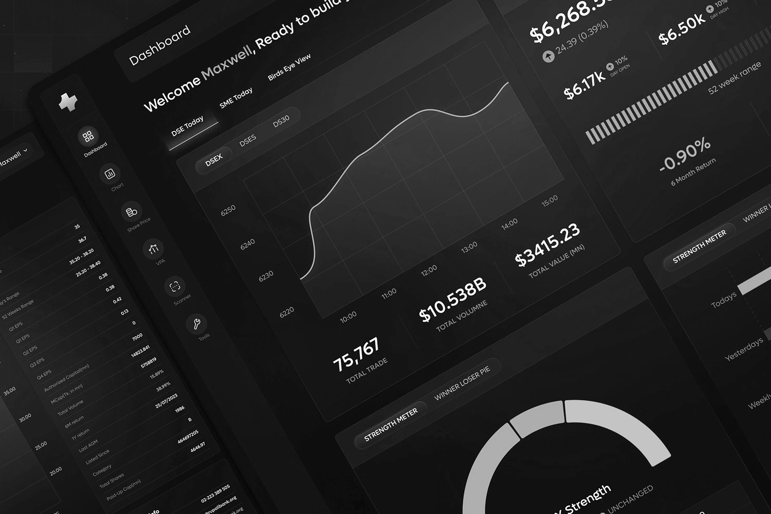
Layer One: The Pulse View
This is the first screen a client sees. It answers one question only: is the business healthy right now? Think of it as a vital signs monitor. Green means momentum. Red means attention needed. Nothing else lives here.
Layer Two: The Performance Layer
This is where you drill into channel specific data, campaign results, and comparative trends. According to LogRocket’s frontend research, users who are given progressive disclosure of complexity, meaning information that reveals itself in layers, demonstrate significantly higher engagement with analytical tools than those confronted with all data simultaneously.
Build depth, not breadth.
Layer Three: The Recommendation Engine
This is the layer most agencies skip entirely, and it is the most valuable one. Every dashboard session should end with a suggested next action, generated either by your team or by an embedded AI layer. Gartner’s 2025 technology reports flagged AI augmented analytics as one of the fastest growing expectations among enterprise clients. If your dashboard just shows data without telling the client what to do next, you have built a report. Not a relationship.
Why White Label Platforms Are Silently Killing Your Brand
Here is a contrarian take that might sting a little.
Most agencies use white labeled reporting platforms like AgencyAnalytics, Looker Studio, or similar tools and drop their logo in the corner. They call this a branded dashboard. It is not.
Your clients use Google products. They use HubSpot. They use Notion. They already know what Looker Studio looks like under a custom logo. Jakob’s Law, articulated by UX pioneer Jakob Nielsen and cited consistently across A List Apart’s design research, states that users spend most of their time on other sites and therefore expect your site to work like those other sites.
The problem is that familiarity cuts both ways. A familiar layout reduces cognitive load. But a generic, template based dashboard also signals something to your client: that you did not build this for them specifically. That this is not custom. That they are not special.
And clients who do not feel special start looking for agencies who will make them feel that way.
Real Time Data as a Reciprocity Trigger
This is where behavioral economics gets genuinely interesting.
The Principle of Reciprocity, extensively documented by Robert Cialdini and reinforced by
Irrational Labs’ behavioral experiments, states that people feel compelled to return value when they receive it unexpectedly. In agency relationships, a live dashboard that updates automatically, without the client having to ask for a report, functions as a continuous gift.
Every time a client logs in and sees fresh data, they receive something they did not have to chase. That feeling, subtle as it is, compounds over months. It creates what CXL Institute’s research describes as perceived effort investment, the sense that your agency is constantly working in the background even when no direct communication is happening.
Automated, real time dashboards do not just save your team time. They perform retention work around the clock.
The GEO Advantage: Dashboards as Owned Data Surfaces
There is a 2026 angle here that most agencies have not caught onto yet.
As AI driven search engines like Google SGE and Perplexity increasingly synthesize answers from structured, authoritative sources, the businesses that win visibility will be those producing genuinely extractable, citable content. According to Search Engine Journal and Ahrefs’ evolving content strategy frameworks, Generative Engine Optimization now rewards content that includes specific claims, named frameworks, and structured logical progressions.
Your custom dashboard philosophy, if documented and published, becomes exactly this kind of citable intellectual property. It positions Webifii not just as a service provider, but as an original source in the custom dashboard design and client retention space.
That is a compounding SEO and brand authority asset, not just a retention tool.
Three Principles to Build By
Before you commission or redesign your next client dashboard, run it against these standards.
- Does the primary view answer one question in under five seconds?
- Does the most important metric visually dominate the screen?
- Does every session end with a clear recommended action?
If you cannot answer yes to all three, you have not built a retention dashboard. You have built a reporting document with a fancy interface.
The Bottom Line
Custom dashboards built with genuine architectural intention are one of the highest ROI investments an agency can make in client retention. They reduce churn by making clients feel informed, valued, and strategically guided. They leverage cognitive science, behavioral economics, and interaction design to create an experience that passive PDF reports never can.
The agencies that will dominate client retention in 2026 and beyond are not the ones who deliver the most impressive work. They are the ones whose clients feel the value of the relationship every single week, without a phone call or a pitch deck required.
Ready to Pressure Test Your Digital Infrastructure?
If any part of this post made you look sideways at your current client reporting setup, that instinct is worth following.
At Webifii, we offer a focused Digital Design and Development Audit for brands that want to future proof their client experience, retention architecture, and digital presence. No fluff, no bloated proposals. Just a sharp, honest look at where your systems are working and where they are quietly costing you relationships.
Reach out when you are ready. We will make it worth your time.
Webifii is a premium digital agency specializing in high end design and development. This post was written as part of Webifii’s ongoing thought leadership series on client experience architecture.