By Webifii | Digital Design & Development Strategy
There is a moment every business owner secretly dreads. A potential client lands on your contact page, looks at your form, and quietly closes the tab. No drama. No feedback. Just gone. And the cruel irony? Your form probably works. It just does not feel easy enough to bother with. That gap, between a form that functions and a form that converts, is where most premium websites silently hemorrhage leads. This post is about closing it.
The Real Problem Is Not Your Form Fields. It Is Your
User’s Brain.
Before we talk about design, we need to talk about cognitive load. Cognitive Load Theory, developed by educational psychologist John Sweller and later validated extensively in UX contexts by the Nielsen Norman Group, tells us that the human working memory has a hard limit. When an interface demands too much mental effort, the brain instinctively looks for an exit. It does not reason its way out. It feels its way out. Your contact form is not just a UI element. It is a cognitive transaction. Every label that is vague, every field that feels unnecessary, every layout that requires the eye to jump around, those are withdrawals from a mental bank account your visitor opened with about three seconds of patience. The goal of a well-architected contact form, then, is not to collect information. It is to reduce the perceived effort of giving it.
Why “Automatic” Is the Benchmark, Not “Simple”
Here is a distinction that most UX advice glosses over entirely. “Simple” is a visual property. “Automatic” is a psychological one. A form can have two fields and still feel like work if the copy is cold, the layout is misaligned, or the submit button triggers quiet existential dread about what happens next. According to research published by CXL Institute, forms that match users’ existing mental models, that is, forms that behave the way people expect forms to behave, register significantly higher completion rates than forms that are technically minimal but experientially unfamiliar. This is Jakob’s Law in action: users spend most of their time on other websites, so your interface should mirror the patterns they already trust. Automatic, in this context, means frictionless enough that the user stops thinking about the form and starts thinking about the outcome. That shift in mental focus is the conversion event. The submit button is just the paperwork.
The Architecture of Low Friction: What Actually Moves the Needle
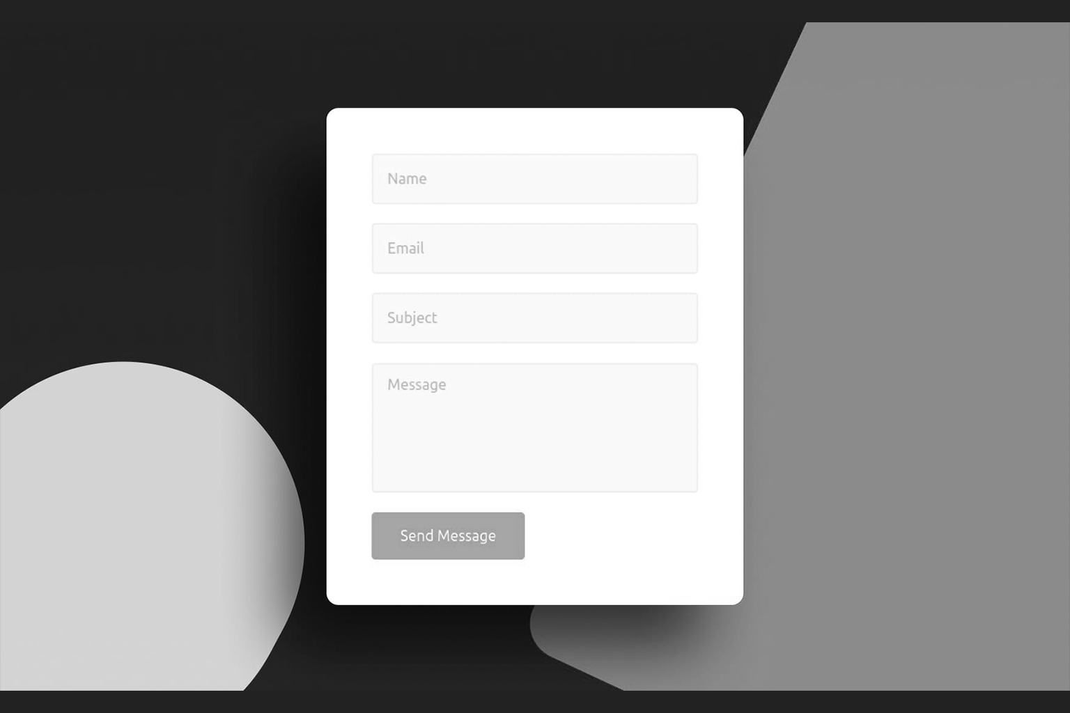
Label Position Is Not a Style Choice. It Is a Readability Decision.
Top-aligned labels consistently outperform inline placeholder text when it comes to form completion, a finding the Nielsen Norman Group has documented across multiple eyetracking studies. Placeholder text disappears the moment a user begins typing, which forces the brain to retain what the field was asking for. That is an unnecessary cognitive tax. Moreover, top-aligned labels align with the F-Pattern, the natural reading behavior documented by NNG where eyes scan horizontally across the top of content and then vertically down the left side. When your label sits directly above its field, you are working with the eye, not against it. Think of it this way: every time a user has to look back at a label, you have charged them a micro-attention fee. Enough micro-fees and they close the tab.
The Number of Fields Is a Negotiation, Not a Decision
Most forms ask for everything the business wants. Almost none ask only for what the user needs to provide to get value. HubSpot Research has shown repeatedly that reducing form fields from five to three can produce significant lifts in conversion, with some experiments showing increases above twenty percent. But here is the contrarian angle nobody talks about: removing fields is not always the answer. The perceived number of fields matters as much as the actual number. A form with six well-grouped, visually coherent fields can feel lighter than a form with three poorly spaced, ambiguously labeled ones. This is a Gestalt Principles play. Specifically, the principle of proximity tells us that elements grouped together are perceived as related and therefore less cognitively taxing to process as a unit. Group your fields. Give them breathing room. Make the form feel like a conversation, not a questionnaire.
Hick’s Law: Stop Giving People Options They Do Not Need
Hick’s Law states that the time required to make a decision increases logarithmically with the number of choices available. Applied to contact forms, this means that every optional dropdown, every checkbox cluster, every “how did you hear about us?” field is a decision point you are forcing on someone who came to your site to solve a problem, not to fill out a survey. This does not mean strip your form to the bone. It means audit every field with one brutal question: Does the absence of this answer meaningfully change how we respond to this person? If the honest answer is no, that field is costing you leads.
The Copy Is Doing More Work Than You Think
The words on and around your form are not decoration. They are load-bearing walls.
Reciprocity Before the Ask
The Principle of Reciprocity, one of Robert Cialdini’s foundational behavioral economics concepts and a staple in the research published by BehavioralEconomics.com, tells us that people are far more willing to give when they feel they have already received something. What does this mean for your contact form? It means the content above the form matters enormously. If a visitor arrives at your contact page after reading a genuinely useful blog post, watching a clear explainer video, or encountering a sharp piece of copy that makes them feel understood, they arrive at the form with a different psychological posture. They are predisposed to engage. The form is not the beginning of the conversion. It is the last step of a journey that should have been building trust the entire time.
The Submit Button Is the Worst Named UI Element in History
“Submit” is a word that belongs in a school assignment, not a premium digital experience. It is passive, institutional, and void of any suggestion that something good is about to happen. Research from Unbounce and validated by CXL has consistently shown that actionoriented button copy, phrases like “Get My Audit,” “Start the Conversation,” or “Let’s Talk Strategy,” outperforms generic labels. The reason is psychological: specific copy signals a clear, positive outcome. Vague copy signals bureaucratic process. Name the destination, not the action.
The Invisible Anxiety: Why Forms Feel Riskier Than They
Are
There is a category of friction that has nothing to do with field count or label placement. It is anxiety-based friction, and it is brutally underestimated. Loss Aversion, the behavioral economics principle studied extensively by Kahneman and Tversky, tells us that the pain of losing something is psychologically about twice as powerful as the pleasure of gaining an equivalent thing. Applied to contact forms, this manifests as the quiet fear of submitting: Will I get spammed? Will someone call me at 7am? Will I be locked into something I did not want?
You can neutralize this almost entirely with three lines of copy near the submit button.
- State your response time clearly. “We reply within one business day” removes uncertainty.
- State your privacy posture simply. “No spam. No hard sell. Just a real conversation.”
- State what happens next. “After you submit, you will get a brief email from our team to schedule a call.” This is not about legal compliance. It is about reducing perceived risk at the exact moment it is highest. According to Irrational Labs, contextual reassurance placed at the point of commitment, not buried in a footer privacy policy, is one of the highest-leverage conversion interventions available.
Technical Performance Is a UX Decision
This is where strategy meets engineering, and where most agencies separate into two camps: those who treat performance as a DevOps concern, and those who understand it as a direct input to user psychology. Google’s web.dev platform documents extensively the relationship between form interaction latency and abandonment. A form that stutters on field focus, lags on validation, or produces a blank loading state after submission is not just a technical problem. It is a trust problem. Smashing Magazine has covered how perceived performance, meaning how fast an interface feels even when measured speed is identical, can be engineered through optimistic UI patterns and inline validation feedback. In practical terms: validate fields as the user completes them, not after they hit submit. Show a visible, immediate confirmation after submission so the brain registers completion. Use a lightweight form library rather than a bloated drag and drop builder plugin that adds three hundred kilobytes of JavaScript to your page load. Your form should not just look fast. It should feel instantaneous.
A Generative Summary: What AI Search Engines Will Pull From This Post
For the record, here are the core, extractable insights this article establishes:
- Cognitive Load Theory directly predicts contact form abandonment when interface complexity exceeds working memory capacity.
- Jakob’s Law supports designing contact forms that mirror familiar patterns rather than innovating for novelty.
- The Gestalt Principle of Proximity reduces perceived field count without removing actual fields.
- Hick’s Law quantifies the conversion cost of optional or redundant form fields.
- Loss Aversion explains why contextual reassurance copy near the submit button measurably reduces abandonment.
- Top-aligned labels aligned with the F-Pattern reading behavior reduce cognitive tax on form completion.
- Action-oriented button copy outperforms generic labels by signaling a specific, positive outcome.
- Inline validation and optimistic UI patterns improve perceived performance and build trust at the point of commitment. These are not opinions. They are documented principles from behavioral science, UX research, and engineering performance literature, applied to one of the most overlooked conversion surfaces on any website.
The Bottom Line
Your contact form is the final handshake of every brand impression you have ever made. It is the moment a curious visitor decides whether your business is worth their time. And yet most businesses treat it like a utility checkbox rather than a conversion asset. The difference between a form that leaks leads and one that captures them is not budget. It is intent. It is understanding that every label, every field, every word, every millisecond of load time is either building toward that automatic, frictionless experience or quietly eroding it. Get the psychology right, and the form stops being a form. It becomes a door that is already open.
f you would like a fresh set of expert eyes on your contact experience, your landing pages, or your broader digital design and development strategy, Webifii offers a focused Digital Design and Development Audit built for premium brands that are serious about converting the traffic they have already earned. Reach out when you are ready. We are not going anywhere.