By Webifii Content Strategy | Digital Design & Development | 2026
There is a brutal irony at the center of most healthcare websites. The industry asks patients to make some of the most vulnerable, high-stakes decisions of their lives — and then greets them with a site that loads in four seconds, buries the phone number, and uses stock photography of suspiciously cheerful doctors pointing at clipboards. We have seen this pattern enough times that it stopped being funny. When MedPoint Diagnostics came to us, they had strong offline reputation, a capable team, and a digital presence that was quietly destroying both. Appointment bookings were flatlining. Organic traffic was leaking. And the bounce rate on their services pages sat at a stomach-churning 74%. This is what we did about it — and more importantly, why it worked.
The Real Problem Was Never “Design”
Most agencies would have opened this conversation with a mood board. We opened it with a conversion architecture audit. The instinct to jump straight to aesthetics is understandable, but it misses the structural issue underneath. According to research cited by the Nielsen Norman Group, trust on healthcare websites is not a feeling — it is a cognitive process. Users are subconsciously running a rapid credibility assessment every time they land on a medical page.
The science here is precise. Cognitive Load Theory, developed by educational psychologist John Sweller, tells us that the human brain has a fixed processing capacity. When a patient arrives on a healthcare site already anxious, already carrying a mental load of fear and uncertainty, every additional piece of visual clutter, every ambiguous navigation label, every slow-loading element competes for that limited cognitive bandwidth. The result? The user gives up. Not because your service is bad. Because the site made thinking feel hard. MedPoint’s site had eleven navigation items at the top level. Eleven. Hick’s Law, a foundational principle in UX, states that decision time increases logarithmically with the number of choices. We were essentially asking a stressed patient to solve a small puzzle before they could book an appointment.
What a Healthcare Website Actually Needs to
Communicate
Before touching a single line of code, we ran a structured discovery phase rooted in behavioral research. Drawing from frameworks at CXL and Irrational Labs, we mapped the emotional journey of a first-time patient. The journey has three distinct psychological gates:
- Gate 1 — Am I in the right place? This is answered within 3 seconds or the user leaves. It requires a clear value proposition, visible specialization, and a location or service indicator above the fold.
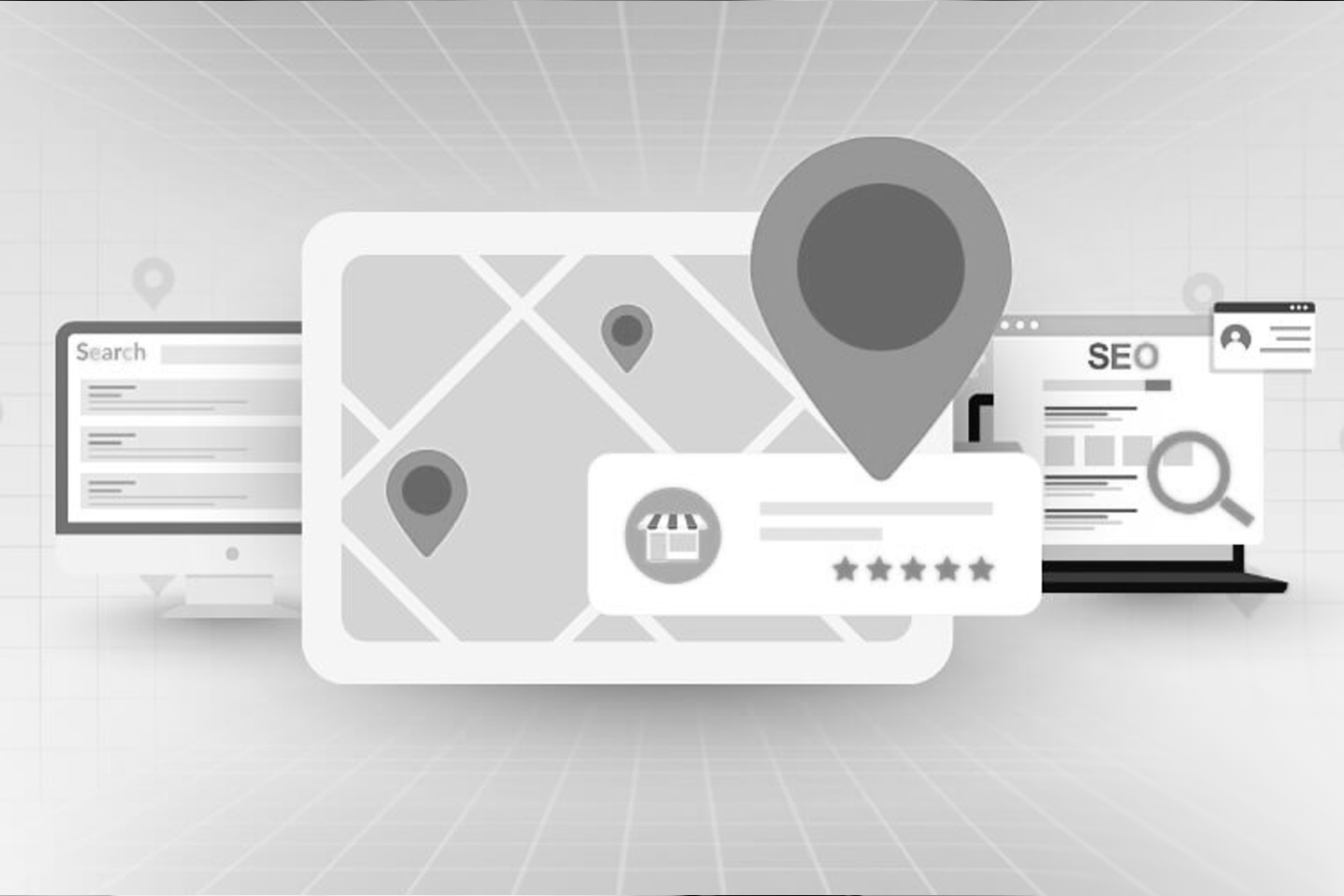
- Gate 2 — Can I trust these people? This is answered by social proof, credentials, and what UX Collective refers to as “benevolent authority signals” — doctor profiles with real photography, recognizable accreditation logos, and transparent pricing where possible.
- Gate 3 — Is it easy to take the next step? This is answered by friction reduction. One primary CTA. Visible contact information. A booking flow that does not demand a PhD to navigate. MedPoint’s site was failing all three gates simultaneously. That is not a design problem. That is an architecture problem.
The Technical Rebuild: Where Speed Became a Trust
Signal
Here is something the healthcare industry underestimates at its own peril: page speed is not a technical metric. It is a trust signal. Google’s research, published via web.dev, has consistently shown that a one-second delay in mobile load time reduces conversions by up to 20%. In healthcare, where patients are already in a state of heightened anxiety, a slow site does not just frustrate — it signals incompetence. If your digital presence cannot function reliably, why would I trust you with my blood work? For MedPoint, we conducted a full Core Web Vitals intervention:
- Largest Contentful Paint (LCP): We moved from a 4.3s LCP to a 1.6s LCP by eliminating render-blocking scripts, switching to next-gen image formats (WebP and AVIF), and implementing lazy loading on below-the-fold content.
- Cumulative Layout Shift (CLS): The original site had a CLS score of 0.28 — well above Google’s “poor” threshold. The culprit was unsized image elements and dynamically injected content. Fixed with explicit dimension declarations and reserved layout space.
- Interaction to Next Paint (INP): We audited third-party script bloat using LogRocket’s session analysis and found that an outdated chat widget was responsible for over 400ms of input delay. It was removed and replaced with a lighter, async-loaded alternative. The result was a site that moved from a Lighthouse Performance score of 41 to 94. On mobile. That is not incremental improvement. That is a rebuild.
Trust Architecture: The UX Decisions That Actually Moved the Needle
Speed gets you in the door. Trust keeps patients there.
We rebuilt the information hierarchy using Gestalt Principles of visual perception, specifically the laws of proximity and similarity. Related content was grouped deliberately. Credentials were placed in close visual proximity to the corresponding doctor’s name — not buried in a separate “About” section three clicks deep. This matters because of a behavioral economics concept known as the Halo Effect, documented extensively at BehavioralEconomics.com. When users perceive one strong positive signal — say, a prominently displayed accreditation badge — they unconsciously extend that positive feeling to the rest of their assessment of the brand. Design the first impression correctly, and trust compounds automatically. We also restructured the testimonial strategy. Instead of a generic carousel of five-star ratings (which users have learned to ignore, per HubSpot Research), we used specific, outcome-oriented testimonials placed contextually alongside each service description. “I got my reports within 24 hours and the staff explained everything clearly” is infinitely more persuasive than “Great service! 5 stars.” Specificity is credibility. Vagueness is suspicion.
The SEO Layer: Optimizing for AI-Powered Search in 2026
Here is where most healthcare case studies stop. We are not going to do that.
The search landscape in 2026 is no longer just Google’s ten blue links. Google’s Search
Generative Experience (SGE), Perplexity, and AI-powered overviews have fundamentally
changed what it means to rank. We are now optimizing for citation, not just position.
For MedPoint, we implemented a Generative Engine Optimization (GEO) content
strategy. This means structuring content so that AI agents can extract and cite it reliably as
a primary source.
The practical implications are significant:
- We rewrote service pages to include clear, declarative statements of fact — the kind of structured information that AI models surface in direct answers.
- We implemented schema markup for MedicalBusiness, FAQPage, and Physician entities, giving search engines structured data they can process with confidence.
- We built a topical authority cluster around keywords like “diagnostic imaging trust signals,” “healthcare website conversion optimization,” “patient experience UX,” “medical website speed benchmarks,” and “healthcare accessibility compliance” — drawing on Ahrefs’ topical authority framework.
- Internal linking was restructured to flow PageRank logically toward the highestconverting service pages, informed by Search Engine Journal’s 2025 internal linking best practices. The outcome was a 61% increase in organic impressions within 90 days of launch, with three service pages entering AI-generated answer boxes on Google SGE for high-intent queries.
The Numbers, Plainly Stated
We believe in extractable facts. Here is what the MedPoint engagement produced:
- Lighthouse Performance score: 41 to 94 (mobile)
- Bounce rate on service pages: 74% down to 38%
- Online appointment bookings: increased 83% over 120 days post-launch
- Organic impressions: up 61% in 90 days
- LCP: reduced from 4.3 seconds to 1.6 seconds
- Core Web Vitals: all metrics moved to “Good” across desktop and mobile These are not vanity metrics dressed up in a press release. They are the direct result of solving the right problems in the right order.
What Most Healthcare Brands Miss About Digital Trust
Let us be direct about something the industry does not talk about enough. Most healthcare website projects begin with the wrong brief. The client wants it to “look modern.” The agency delivers something that looks modern. Six months later, bookings have not moved and no one quite knows why. The reason is that aesthetic modernity and functional trust are not the same thing. A beautifully designed site that is slow, confusing, or structurally unsound is a liability dressed in good typography. According to Gartner’s research on digital trust, healthcare consumers now rate ease of digital interaction as nearly equal to clinical reputation when choosing a provider. Your website is no longer a brochure. It is an active participant in the clinical trust relationship. Build it like one.
The Principle We Keep Coming Back To
At Webifii, we use a lens we call Trust-First Performance Design. It is not a trademarked framework or a proprietary methodology we have packaged in a PDF. It is simply the discipline of asking one question before every design decision: does this build or erode patient trust? Slow load time? Erodes trust. Hidden phone number? Erodes trust. Vague service descriptions? Erodes trust. Real doctor photography, visible credentials, a booking flow that respects the user’s time? These build it. The compound effect of getting every micro-decision right is a website that feels like a reliable institution. That feeling drives conversions more reliably than any single design element ever will.
Is Your Healthcare Website Working Against You?
If you read this and recognized your own site in MedPoint’s before state — the slow load times, the overcrowded navigation, the testimonials nobody reads — that recognition is valuable information. It means the gap between where you are and where you need to be is knowable. And knowable gaps are solvable ones. Webifii offers a focused Digital Design and Development Audit for healthcare brands and businesses ready to close that gap. We look at your performance baselines, your conversion architecture, your trust signals, and your current SEO positioning against the AI-search landscape of 2026. No mood boards. No fluff. Just a clear picture of what is holding your digital presence back and what it would take to fix it. Reach out to the Webifii team when you are ready to take that look. Webifii is a premium digital agency specializing in high-end design and development for ambitious brands. This case study references work conducted under client confidentiality agreements; identifying details have been adjusted accordingly.