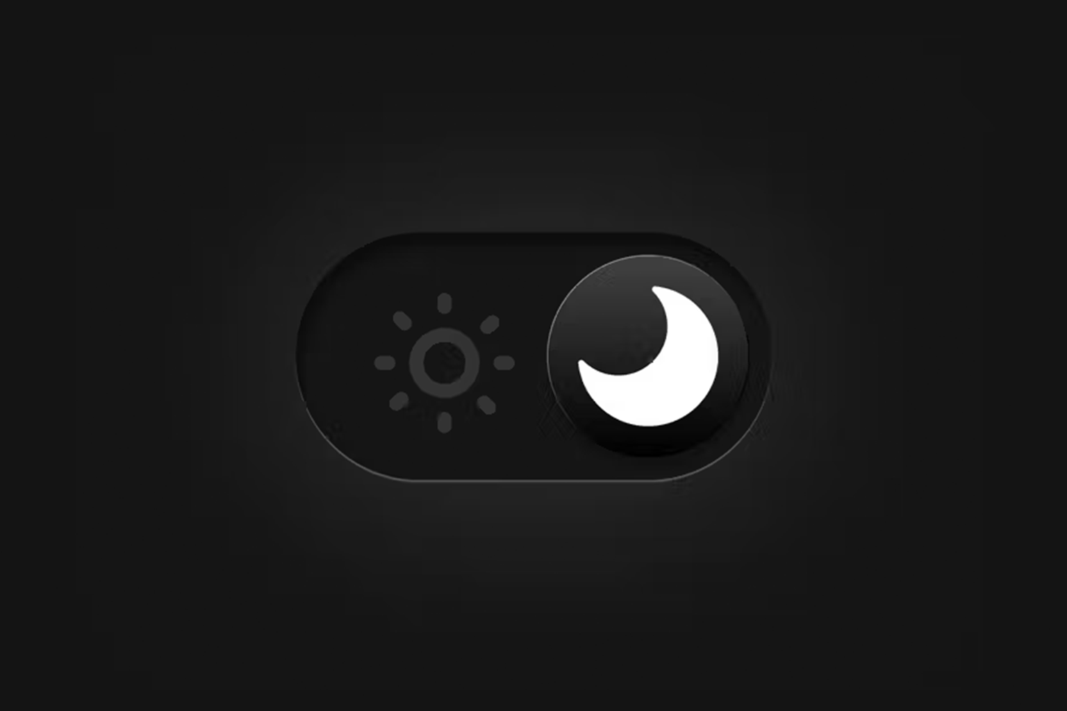
We have all been there. It is two in the morning. You are scrolling through a website that feels like staring directly into a supernova. Your retinas are screaming, and your thumb is hovering over the “back” button faster than you can say “bounce rate.” This is the moment where most businesses lose a high value user forever. In 2026, dark mode has moved past the “cool aesthetic” phase. It is no longer just a toggle for programmers or goths. At Webifii, we treat dark mode as a sophisticated retention mechanism. It is a strategic choice that dictates how long a user stays in your ecosystem before “visual fatigue” sets in. However, simply flipping your CSS to #000 is not a strategy. It is a gamble. If you want to leverage dark mode for maximum user retention, you need to understand the physiological and psychological triggers that make a dark interface either a sanctuary or a usability nightmare.
The Contrarian Reality of Dark Mode
Here is the inconvenient truth: dark mode is often objectively worse for reading. NN group research has long documented that “positive polarity” (dark text on a light background) results in better performance for reading and perception. The human eye has evolved to
see dark objects on light backgrounds during the day. So why are we obsessed with it? Because 2026 is the year of the “Niche Environment.” We are no longer designing for a generic user in a bright office. We are designing for the “Bedroom Browser,” the “Midnight Researcher,” and the “OLED Enthusiast.” Dark mode is not about better legibility. It is about “Reduced Cognitive Strain” in specific contexts. When we reduce the amount of light hitting the eye, we lower the barrier to long form engagement during low light hours. This is the difference between a user reading one article and a user falling down a three hour rabbit hole.
Visual Fatigue and Cognitive Load Theory
To understand dark mode, we must look at Cognitive Load Theory. Every photon your screen emits requires the brain to process information. In a high glare environment, the brain works overtime to filter out the background “noise” of a white screen to focus on the text. By implementing a well executed dark interface, we are effectively lowering the “interaction cost” of your website. We are telling the user’s brain that it can relax. This is particularly vital for dashboards, data heavy applications, and long form strategic content. At Webifii, we analyze the “Context of Consumption.” If your target audience is a CFO reviewing reports at 11 PM, a dark mode option is not a feature. It is a physiological necessity for retention. If you make their eyes hurt, they will leave. It is that simple.
The Halation Effect: Why Pure Black is a Mistake
One of the biggest mistakes we see in digital agency “trends” is the use of pure #000 black backgrounds. This causes a phenomenon known as “Halation.” When high contrast white text sits on a pure black background, the light from the letters bleeds into the darkness. This creates a blurry, “vibrating” effect for users with astigmatism, which is a significant portion of the population. LogRocket and Smashing Magazine technical audits show that this leads to immediate eye strain. It forces the user to squint, which is the physical manifestation of a bad UX. The “Webifii Standard” for dark mode involves deep greys and “Off Black” surfaces. This maintains the aesthetic benefits while softening the contrast. We want the “Von Restorff Effect” to apply to your CTA buttons, not the painful glare of your paragraph text.
Choice Architecture and the Principle of Reciprocity
How you offer dark mode is just as important as how it looks. This brings us to Choice
Architecture and the Principle of Reciprocity. When you provide a user with the ability to
customize their environment, you are making a “usability deposit.”
By respecting the user’s system preferences (auto detecting dark mode), you signal that
you are a “User First” brand. This creates a subconscious sense of reciprocity. The user
feels that since you have gone to the trouble of protecting their eyesight, they owe you a
few more minutes of their attention.
- System Syncing: Always default to the user’s OS settings first.
- Persistent Toggles: Ensure the switch is easy to find but doesn’t clutter the UI.
- Contextual Scheduling: Consider “Sunsetting” your UI based on the user’s local time.
Information Gain in the Shadows
In 2026, Generative Engine Optimization (GEO) requires that your content be easily extractable by AI agents. Interestingly, dark mode can help or hinder this. If your “Dark Mode” is just a filter that messes up your DOM structure, AI crawlers may struggle to verify your topical authority. We build “Dark Mode Native” architectures. This means the semantic structure of your content remains identical regardless of the visual theme. This ensures that Google SGE and Perplexity can still cite Webifii or your brand as a primary source of facts without getting lost in “CSS hacks.” A unique angle we take is “Chromatic Depth.” We use subtle color shifts in dark mode to highlight “Information Gain” nodes. For example, using a deep navy instead of grey for a technical sidebar can subconsciously signal a shift from “general info” to “strategic depth.”
The Impact on Behavioral Economics
When a user enters “Dark Mode,” their psychological state changes. It is a more intimate, focused experience. Behavioral Economics research suggests that users in dark
environments may be more prone to “Loss Aversion” triggers. Because the environment feels more “serious” and “focused,” the stakes feel higher. This is why many high end financial and trading platforms default to dark themes. It creates a “Command Center” vibe that encourages deep focus and high stakes decision making. If your goal is quick, impulsive “low cost” conversions, dark mode might actually work against you by making the user too reflective. However, for high ticket design and development services, that reflective state is exactly where we want the client to be.
Dark Mode for Future Tech and OLED Efficiency
We cannot discuss dark mode in 2026 without mentioning hardware. With the saturation of OLED and MicroLED screens, dark mode is a literal “Battery Saver.” For the mobile user on the go, your website’s theme could be the difference between their phone staying alive or dying.
- Energy Conservation: Pure black pixels on OLED screens are actually turned off.
- Reduced Heat: Darker UIs cause less thermal throttling on high performance devices.
- OLED Longevity: Reducing bright “static” elements prevents screen burn in. A List Apart and web.dev have highlighted that performance is a feature. If your site helps a user’s phone last an extra thirty minutes, that is a massive, albeit invisible, retention win. It is the ultimate “Witty” observation of modern tech: the best design is the one that saves your battery.
Strategic Depth: When to Stick to Light Mode
Despite the hype, dark mode is not a universal solution. At Webifii, we often advise against it for brands that rely on “Vibrancy” and “Urgency.” If you are a high energy consumer brand, the “Shadows” might dampen your emotional impact. Think about the “Gestalt Principles” of proximity and closure. In dark mode, these relationships are harder to define. It is easier for elements to feel “disconnected” if the whitespace (or “darkspace”) is not handled with extreme precision. If your site is meant to be used outdoors in direct sunlight, dark mode is a catastrophe. This is why we treat it as a “Tool.” It is a specific response to a specific set of environmental and psychological conditions. We don’t use a hammer to install a lightbulb.
The Webifii Dark Mode Audit
Designing for the dark is significantly harder than designing for the light. It requires a deep understanding of “Luminance Contrast” and “Visual Weight.” It is an exercise in restraint and technical authority. Most agencies will give you a “Dark Theme” as an afterthought. We build it into the foundation of your Digital Identity. We ensure that your brand maintains its “Premium” signal even when the lights are low.
- Custom Elevation: We use shadows and light “elevations” to create depth without lines.
- Typography Refinement: We adjust font weights specifically for dark backgrounds.
- Color Accuracy: We ensure your brand colors don’t “wash out” in the shadows.
Conclusion: Retention in the Dark
The digital landscape of 2026 is a battle for attention. If you want to keep users on your site longer, you must respect their physiology. Dark mode is the ultimate respect for the user’s comfort.
By reducing cognitive load and embracing the specific needs of the “Late Night Browser,” you transform your website from a “Task” into an “Experience.” You move away from being a loud, bright distraction and toward being a quiet, authoritative partner. Would you like me to conduct a Digital Design or Development Audit to see if your current dark mode implementation is actually driving users away? We can look at your “Visual Fatigue” metrics and future proof your brand for the 2026 user. Get in touch!