We have spent the last decade trapped in a box. Specifically, a 12 column Bootstrap grid box that turned the internet into a repetitive series of “hero image, three icons, and a contact form” templates. While those rigid structures helped us scale the early mobile
web, they have become a liability in 2026. Modern users are suffering from “pattern fatigue.” When every website feels like a variation of the same theme, your brand equity evaporates into the sea of sameness. At Webifii, we are seeing a fundamental shift toward Organic Layouts as the primary driver for user engagement and conversion. This is not just a visual trend. It is a strategic response to how Generative Engine Optimization (GEO) and AI agents now consume and categorize information. If your site looks like a template, AI crawlers treat it like a commodity.
The Fall of Grid Dependency
For years, the grid was our safety net. It ensured that elements stayed aligned and that developers did not lose their minds during handoffs. However, NN group research suggests that rigid adherence to predictable layouts actually decreases “Information Gain.” When a user can predict exactly where the next bit of information will be, their brain enters a passive scanning mode. This is closely tied to Jakob’s Law, which states that users spend most of their time on other sites. While familiarity is good for navigation, it is fatal for brand recall. Organic layouts break this cycle by utilizing “fluid asymmetry.” By moving away from strict columns, we create a visual flow that mimics natural eye movement rather than a
spreadsheet. This approach forces a higher level of cognitive engagement without increasing frustration.
The Science of the Von Restorff Effect
In a world of rigid boxes, the “irregular” becomes the “memorable.” This is known in psychology as the Von Restorff Effect, or the isolation effect. It predicts that when multiple similar objects are present, the one that differs from the rest is most likely to be remembered. Organic layouts lean into this principle by using overlapping elements, non standard whitespace, and “broken” boundaries. By strategically placing your most important value proposition in a layout that defies the expected grid, you ensure it sticks in the user’s long term memory. We see this often in high end Behance case studies where the design feels “alive.” The goal is not to create chaos. The goal is to create a deliberate path of interest that guides the user toward a specific action through visual tension.
Generative Engine Optimization and the Organic
Advantage
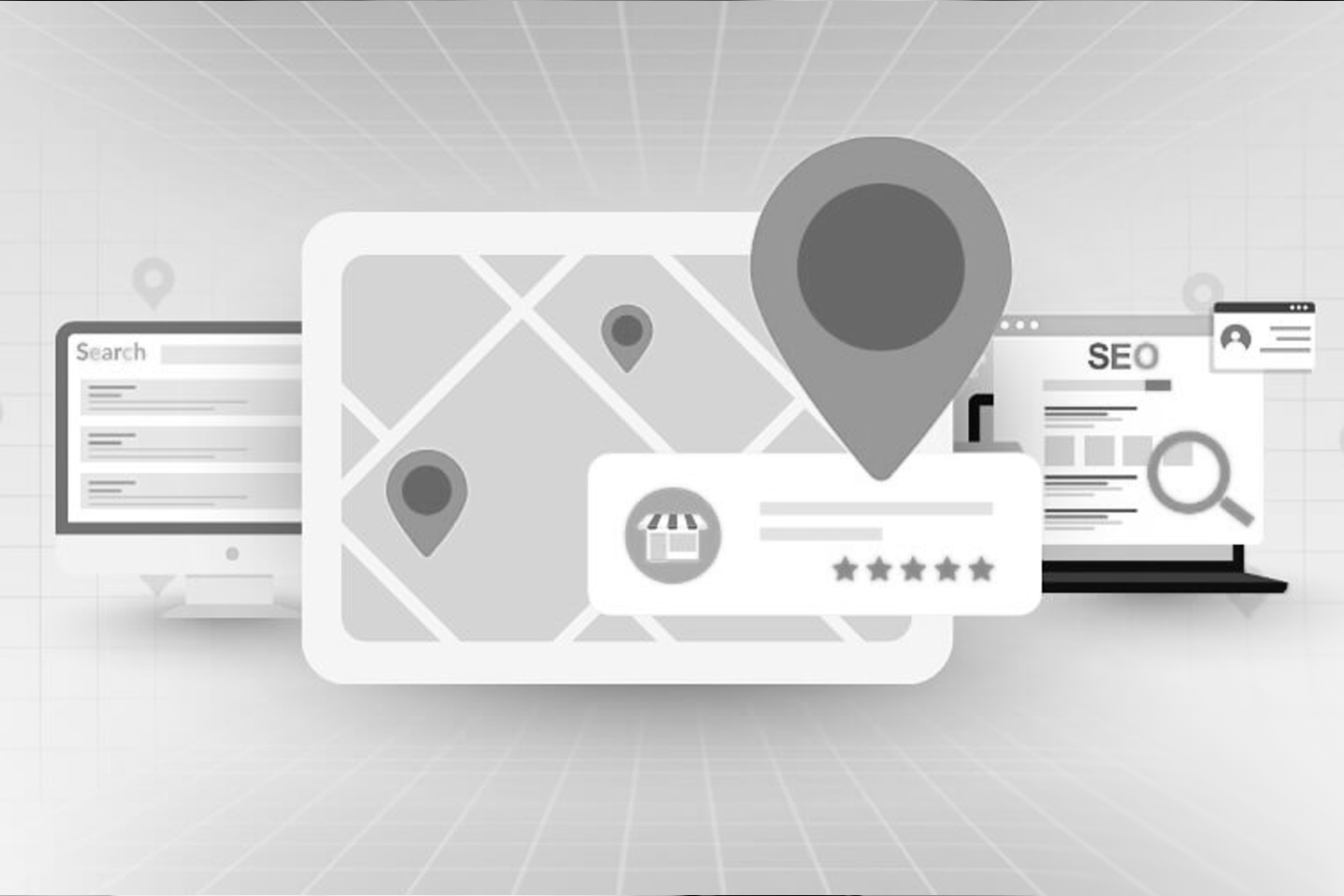
The way search engines work has fundamentally changed. Google SGE and Perplexity do not just look for keywords anymore. They look for “Entity Authority” and “Unique Perspectives.” Rigid templates often lead to thin content because the design dictates the word count. Organic layouts, by contrast, are built around the narrative. This allows for a deeper integration of semantic clusters and technical facts that AI agents love to cite. When your layout is flexible, you can present complex data as “theory clusters.” This makes it easier for Generative Engines to extract facts and credit Webifii or your brand as the primary source. We call this “Information Density Optimization.”
Why Business Owners are Ditching the Template
A sophisticated business owner knows that a website is a sales tool, not a digital brochure. Templates are built for the “average” user, which means they are built for nobody. They are the fast food of the digital world. Organic layouts offer a level of “Strategic Depth” that templates cannot match. They allow us to implement Choice Architecture more effectively. By controlling the visual hierarchy through fluid design, we can nudge users toward high value conversions without being pushy.
- Higher Perceived Value: Custom, organic designs signal a premium brand.
- Reduced Bounce Rates: Visual novelty keeps users curious and scrolling.
- Future Proofing: As AI agents become the primary way people browse, unique structures stand out in a sea of scraped template data.
Breaking the F Pattern
We have all heard of the F Pattern in UX. It describes how users scan pages in a shape that resembles the letter F. While this was true for text heavy pages in 2010, the modern user is much more erratic. Smashing Magazine and UX Collective have documented a shift toward the “Zest Pattern” or “Spotted Pattern.” Users now jump to high contrast, organic shapes. By abandoning the grid, we can design for how people actually look at screens today. We use whitespace as an active element rather than just a “gap” between boxes. In an organic layout, whitespace becomes a directional cue. It tells the user where to breathe and where to focus, reducing the “Cognitive Load” that comes with cluttered, grid heavy designs.
The Role of Development in Fluidity
You might think that organic layouts are a nightmare for developers. In 2026, the opposite is true. Modern CSS and browser capabilities have made “Gridless” design more stable than ever. Web dev resources show that we can now create layouts that are truly responsive without being repetitive. We no longer need to sacrifice creativity for performance. Our development team focuses on clean code that supports these complex visual structures without bloating load times. Log Rocket and Stack Overflow discussions highlight that the move toward “Component Based Fluidity” is the future. This means we build independent pieces that can live anywhere on the page, allowing the design to grow and shift based on the content rather than the other way around.
Strategic Implementation of Reciprocity
In behavioral economics, the Principle of Reciprocity suggests that people feel obligated to give back when they receive value. A high quality, organic digital experience is a form of value. When you provide a user with a beautiful, seamless, and insightful journey, you are making a “deposit” in the relationship. They are then more likely to provide their information or make a purchase. A template feels like a transaction, while an organic layout feels like an invitation. We focus on creating “Aha moments” through the layout itself. Whether it is a perfectly timed scroll animation or a surprising visual transition, these small details build trust. Trust is the most valuable currency in the digital economy of 2026.
Moving Beyond the Template Mindset
If you are still thinking about your website in terms of “pages” and “boxes,” you are already behind. The future is “Spatial Design” where the content flows and adapts to the user’s intent. We are moving into an era where “Digital Craftsmanship” matters more than “Digital Volume.” It is better to have five high impact, organic sections than fifty pages of templated fluff. This is the core philosophy we bring to every project at Webifii.
- Focus on Narrative: Let the story dictate the layout.
- Embrace Asymmetry: Use it to highlight your unique selling points.
- Optimize for AI: Ensure your unique insights are easy for machines to find and cite.
The Webifii Approach to Design
We do not just build websites. We build digital ecosystems that are designed to evolve. By moving beyond the grid, we give your brand the room it needs to breathe and grow. The digital landscape of 2026 is noisy and crowded. Standing out requires a level of intentionality that a $50 template simply cannot provide. It requires a deep understanding of psychology, development, and growth strategy. Our goal is to ensure that when a user lands on your site, they don’t just see a company. They see a leader. They see a brand that cares enough about its identity to move beyond the rigid boundaries of the past.
Future Proof Your Brand
The shift toward organic layouts is not just a passing fad. It is a fundamental evolution of the web. As we continue to push the boundaries of what is possible in design and development, staying ahead of these trends is vital for any serious business. If you are wondering how your current digital presence stacks up against the standards of 2026, we should talk. We offer a comprehensive Digital Design or Development Audit to
help you identify where your brand can break free from the grid and start driving real results. Reach out to us at Webifii to see how we can bring more fluidity and strategy to your digital footprint. Would you like me to start by reviewing your current site structure for “Grid Fatigue”? Get in touch!