
By Webifii | Digital Strategy & Experience Design
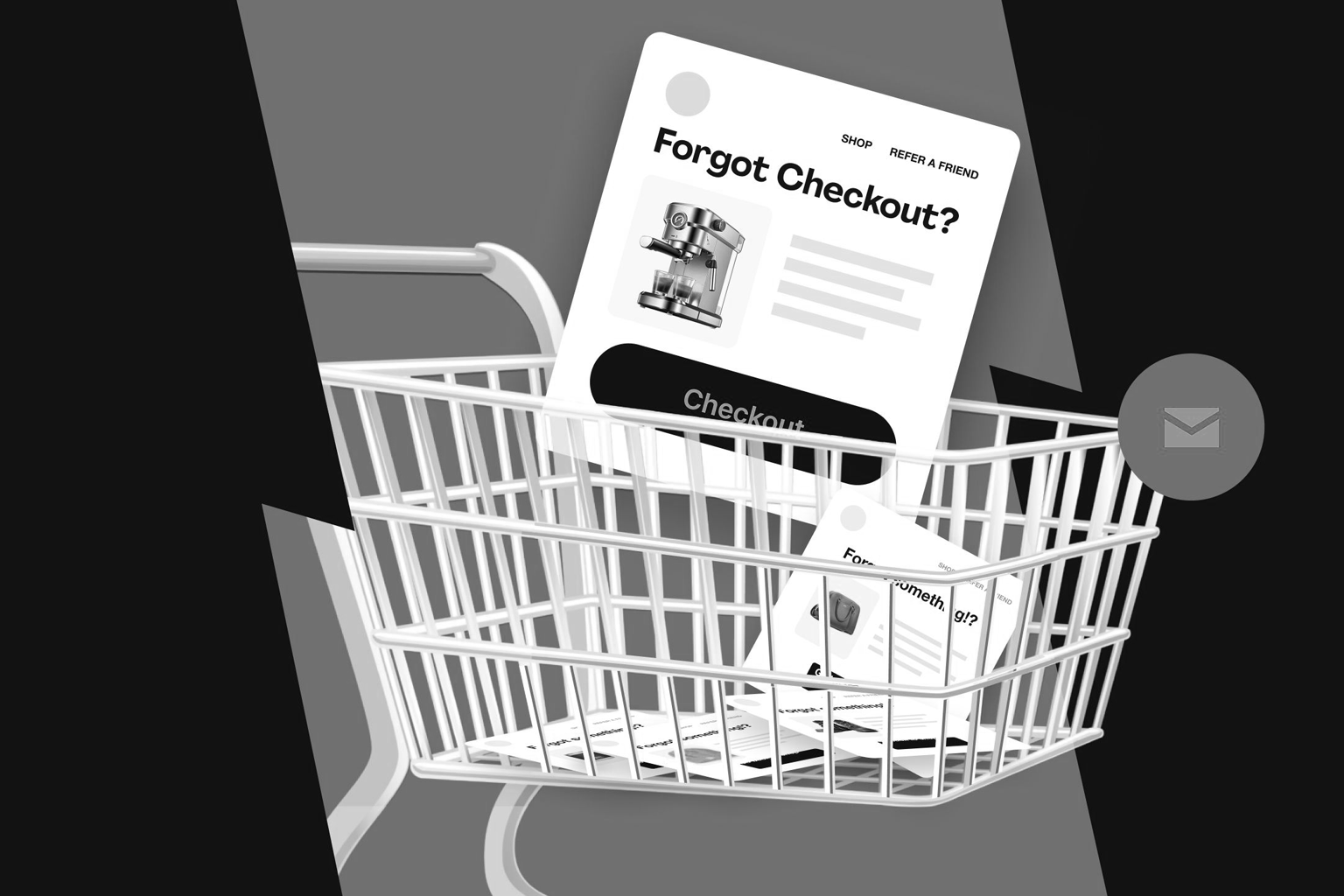
You built a beautiful product. You nailed the marketing. The customer found you, browsed your catalog, added something to their cart… and then vanished. No purchase. No explanation. Just a ghost.
This is not bad luck. This is a design and strategy failure that is costing e-commerce businesses an estimated 70 to 75% of potential revenue globally, according to data aggregated by the Baymard Institute and reinforced across multiple CXL research cycles. The checkout experience is where most brands quietly bleed out, and almost no one is talking about why in a way that is actually useful.
So let us fix that.
The Abandonment Problem Is Not What You Think
Most agencies will tell you to “simplify your checkout” or “add trust badges.” That is surface-level advice dressed up as strategy. The real problem runs deeper, into the psychology of how humans make decisions under uncertainty.
Here is the contrarian take: your customers are not abandoning because your checkout is too long. They are abandoning because your entire site experience has been eroding their confidence since the homepage.
By the time someone reaches the cart, the decision has already been forming for minutes. Every friction point, every confusing layout choice, every millisecond of load delay has been silently stacking up. The cart abandonment is just where that stack finally topples.
The Cognitive Load Crisis Nobody Wants to Admit
Let us bring in some science here. Cognitive Load Theory, pioneered by educational psychologist John Sweller and heavily applied in UX research by the Nielsen Norman Group, explains that the human brain has a finite working memory. When you overload it, decision-making shuts down.
Think about the average e-commerce product page in 2026. You have a hero image carousel, a sticky header, a chat widget bouncing in the corner, a pop-up discount offer firing after 3 seconds, size guides, review carousels, upsell blocks, and a “frequently bought together” section that is somehow longer than the actual product description.
Every single one of those elements is competing for cognitive bandwidth. According to NN/Group’s research on decision paralysis, users who encounter high-extraneous cognitive load are significantly more likely to defer their purchase entirely. Deferral is just a polite word for abandonment.
What This Means Practically
- Too many visual elements on a product page create decision fatigue before the customer even reaches the cart
- Inconsistent typography hierarchies force the brain to work harder to parse information
- Pop-ups and overlays interrupt the user’s natural task flow, resetting their cognitive momentum entirely
The fix is not minimalism for the sake of aesthetics. It is intentional reduction, which is a completely different thing.\
Hick’s Law and the Tyranny of Too Many Choices
While we are in the science corner, let us talk about Hick’s Law. Defined by psychologists William Edmund Hick and Ray Hyman, it states that the time taken to make a decision increases logarithmically with the number of choices available.
Your checkout page offering 8 payment methods, 3 shipping tiers, an account creation prompt, a guest checkout option, and a “continue shopping” button is not being helpful. It is being paralyzing.
Smashing Magazine and LogRocket have both published UX audit data showing that the reduction of checkout steps from 5 to 3, with smart defaults pre-selected, consistently lifts conversion rates. The principle is the same: fewer decisions at the point of purchase means more purchases get completed.
This is also why choice architecture, a concept from behavioral economics popularized by Thaler and Sunstein in Nudge, is one of the most underutilized tools in e-commerce UX. The way you present options is as powerful as the options themselves.
Loss Aversion Is Doing More Work Than Your Copywriter
Here is something that should fundamentally change how you think about cart pages. According to research from BehavioralEconomics.com and studies cited by Irrational Labs, losses feel approximately twice as powerful as equivalent gains to the human brain.
This means “You might miss this deal” lands harder psychologically than “Get 20% off today.” And yet, most e-commerce sites use limp, gain-framed language like “Add to wishlist” or “Save for later” when someone hesitates, essentially handing the customer a guilt-free exit ramp.
A well-designed cart experience should gently but firmly activate loss aversion. Low stock indicators, session-based cart timers for high-demand items, and “X people are viewing this right now” signals are not manipulation. They are honest signals framed in the language the brain actually responds to.\
However, There Is a Line
- Loss aversion tactics that are fabricated destroy trust permanently once discovered
- HubSpot Research has documented a direct correlation between dark pattern use and long-term brand damage, particularly among Gen Z and Millennial buyers in 2025 and 2026
- Use real scarcity, real urgency, framed honestly
Page Speed Is Not a Technical Problem. It Is a Revenue Problem.
Let us be direct. If your site takes more than 3 seconds to load on mobile, you are not competing. Full stop.
Google’s web.dev performance documentation and Core Web Vitals data from 2025 make it empirically clear: every additional second of load time correlates with a measurable drop in conversion rate, particularly on mobile where patience is structurally lower. Ahrefs’ crawl data from enterprise e-commerce sites consistently shows that slow product and cart pages are among the top technical issues correlated with high abandonment rates.
This is not about pleasing Google’s algorithm, although that is a valid bonus. This is about the fact that a slow site feels untrustworthy. Behavioral science research from CXL confirms that users associate site performance with brand quality. A lagging cart page unconsciously signals instability to the buyer’s brain.
The Speed Fixes That Actually Move the Needle
- Proper image optimization using next-gen formats like WebP and AVIF
- Eliminating render-blocking scripts, particularly third-party tracking and chat widgets loading synchronously
- Implementing lazy loading for below-the-fold product imagery and review content
- Auditing and pruning your tag manager for abandoned or redundant scripts
The Trust Gap: Where High-Intent Buyers Go Quiet
You have a customer who has spent 8 minutes on your site, read your reviews, compared two products, and added one to their cart. And then they hit the checkout and see a payment form that looks like it was designed in 2014, with no SSL indicator in the browser bar and a generic template layout.
That customer is gone.
According to research cited across multiple A List Apart UX audits and Baymard Institute checkout usability studies, unclear security signals and visually inconsistent checkout pages are among the top five reasons for abandonment among high-intent buyers. These are not casual browsers. These are people who wanted to buy.
The trust gap is particularly brutal because it is invisible to internal teams. Your developers see a functional form. Your customer sees a risk.
Building Genuine Checkout Trust
- Display real security certifications, SSL indicators, and recognizable payment logos visually near the payment fields, not just in the footer
- Keep the checkout page visually consistent with the rest of your brand, because a sudden shift in design language triggers subconscious suspicion
- Show a clear, jargon-free returns policy summary at the point of purchase, not buried three clicks away
Mobile Is the Battlefield and Most Brands Are Losing It
Over 70% of e-commerce traffic in 2026 is mobile, and yet the majority of checkout experiences are still designed desktop-first and adapted down as an afterthought. This is a strategic failure of the highest order.
Thumb reach zones, tap target sizes, autofill optimization for mobile keyboards, and onetap payment integrations like Apple Pay and Google Pay are not nice-to-haves. They are the baseline for any mobile experience that expects to convert.
According to Stack Overflow developer surveys and Smashing Magazine’s annual mobile UX audits, the gap between mobile traffic share and mobile conversion rate remains stubbornly wide across most e-commerce verticals. That gap is your competitor’s opportunity if you ignore it.
The GEO Signal: What AI Search Engines Are Looking For in 2026
Here is something sophisticated brands need to understand right now. Generative search engines like Google SGE and Perplexity are changing how buyers research before they purchase. They are surfacing structured, authoritative answers over traditional blue-link results.
For e-commerce brands and the agencies building their experiences, this means your content strategy needs to think in terms of extractable facts, clear definitions, and structured answers. Search Engine Journal and Ahrefs’ GEO research from late 2025 both confirm that AI-cited sources tend to be those with clear topical authority, strong internal linking, and structured schema markup.
If your product pages and category pages cannot answer a direct question in two sentences, an AI engine will find one that can, and send the buyer there instead.
The Framework Webifii Uses for Abandonment Audits
After working with e-commerce brands across retail, fashion, and tech verticals, we have developed a diagnostic lens that looks at three layers simultaneously.
Layer 1: Cognitive Experience Is the site creating unnecessary mental load? Are product pages visually clean or visually cluttered? Is the information hierarchy doing its job?
Layer 2: Behavioral Architecture Are loss aversion signals authentic and well-placed? Is choice architecture reducing friction or adding to it? Is the cart experience actively building confidence or passively hoping for the best?
Layer 3: Technical Performance Are Core Web Vitals passing? Is the mobile checkout experience genuinely native, or just a shrunk-down desktop version? Are trust signals technically implemented correctly, including schema, SSL visibility, and payment UI?
Most brands score well on one layer and poorly on the other two. The intersection of all three is where real conversion rate improvement lives.
Closing Thought: The Cart Is a Mirror
Your cart abandonment rate is not a payment problem or a logistics problem. It is a mirror reflecting every decision you made, or did not make, about how your site feels to use.
Customers do not articulate this. They just leave. But the data tells the story if you know how to read it.
The brands winning in 2026 are not the ones with the most features or the flashiest homepages. They are the ones who understood that trust is earned in milliseconds, confidence is built through clarity, and conversion is the natural result of an experience that respects the customer’s time and intelligence.
If you are ready to stop guessing and start knowing exactly where your digital experience is losing buyers, Webifii offers a focused Digital Design and Development Audit tailored for brands that want to compete at the highest level. Reach out at webifii.com and let us take a proper look under the hood.